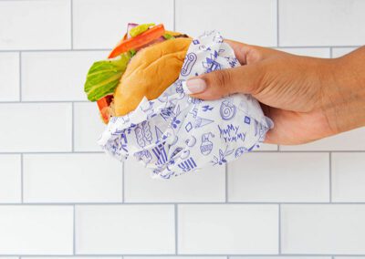
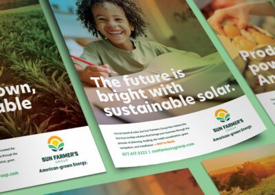
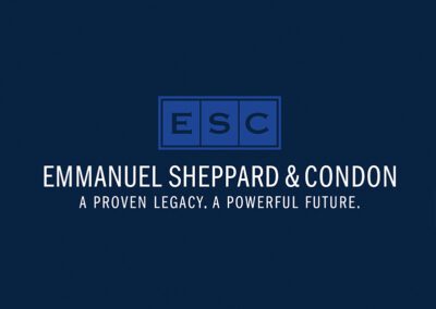
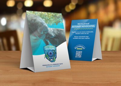
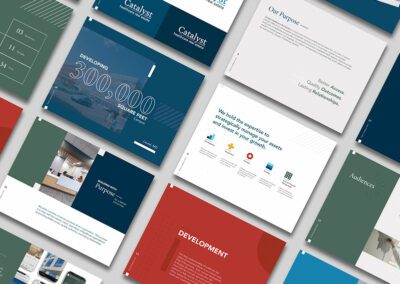
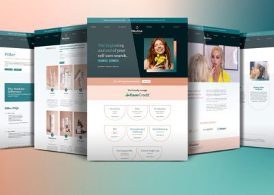
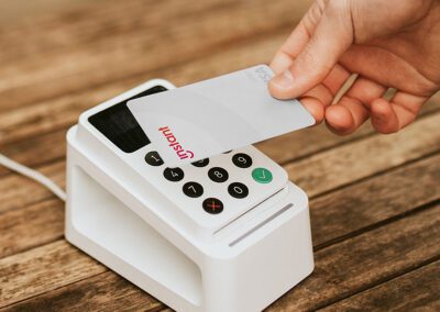
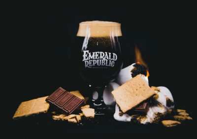
AllBrand DevelopmentCinematic StorytellingDigital ExperiencesFull Service PartnershipsMarketing StrategySocial Media Management Greek’s Catering & EventsSocial Media Management Sun Farmer’s GroupBrand Development, Digital Experiences, Full Service Partnerships, Marketing Strategy, Social Media Management Emmanuel Sheppard & CondonBrand Development, Cinematic Storytelling, Digital Experiences, Full Service Partnerships Pensacola & Perdido Bay Estuary ProgramBrand Development, Digital Experiences, Marketing Strategy Andrews MedicineBrand Development, Digital Experiences Catalyst Healthcare Real EstateBrand Development, Digital Experiences, Full Service Partnerships Neuline AestheticsBrand Development, Digital Experiences, Full Service Partnerships, Marketing Strategy, Social Media Management Instant FinancialBrand Development, Digital Experiences, Full Service Partnerships Neuline HealthBrand Development, Cinematic Storytelling, Digital Experiences, Full Service Partnerships, Marketing Strategy, Social Media Management Way PartnersBrand Development, Digital Experiences KudosBrand Development, Digital Experiences, Full Service Partnerships, Marketing Strategy, Social Media Management Emerald Republic Brewing co.Brand Development, Cinematic Storytelling, Digital Experiences, Social Media Management